
What just happened? Facebook is in the middle of an identity crisis. The company started as a social media platform but over the years through a combination of both product evolution and various acquisitions, it has become much more. On Monday, Facebook took a major step in helping to clarify its brand with the introduction of a new company logo.
As Chief Marketing Officer Antonio Lucio highlights, Facebook will use the new branding to help distinguish Facebook the company from the Facebook app.
It’ll also use the new branding to help better communicate its ownership in other ventures it operates like WhatsApp, Instagram, Messenger and Portal.

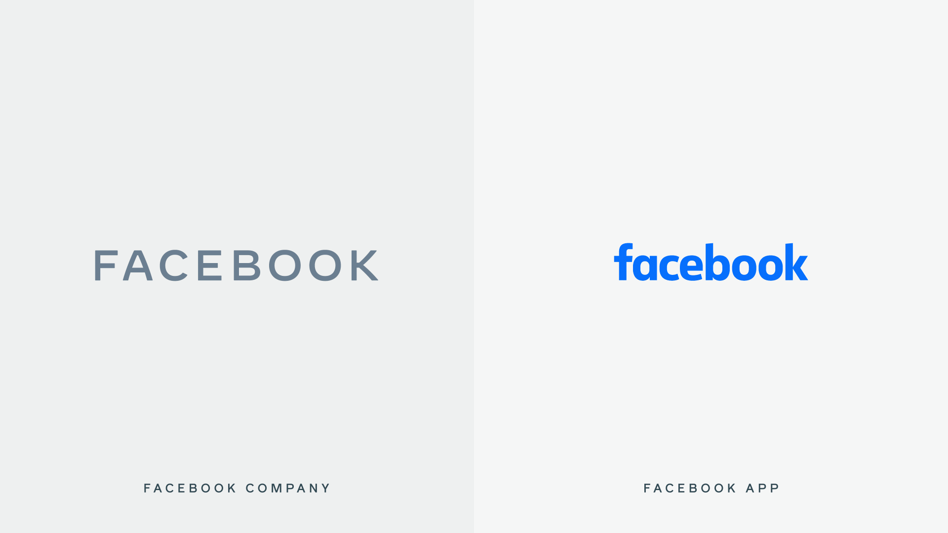
Facebook described the task of designing its new company branding as a collaborative effort based on three foundational design behaviors: clarify, empathy and creating space. It uses custom typography, rounded corners, capitalization and open tracking to “create visual distinction between the company and the app.”
From the perspective of an ordinary user that isn’t into typography, it’s little more than the word “Facebook” written in a plain, all caps font that matches the color of its individual brands. It’s nothing if underwhelming but that’s the design direction that major companies are taking these days.
For those that are into typography, Facebook has a full blog post on the subject that may be of interest.
Facebook has been taking a more proactive approach to letting people know which companies and products it owns. You’ll now find company endorsements in many of the products Facebook owns like Oculus and Workplace.
The new company branding will be rolling out in products and marketing materials over the coming weeks.
Source link


