iPhone Glass: When Windows 7 launched back in 2009, one of its standout features was its sleek, glass-like interface – subtle shadows, rounded edges, and a sense of depth that made windows and buttons feel almost tangible. Now, if this massive iOS 19 leak is to be believed, Apple seems to be channeling a bit of that same magic for the next iPhone refresh.
Apple’s iOS 19 update is set to debut at WWDC in June and is reportedly bringing with it the biggest visual overhaul in a decade. One of the most striking changes is a subtle return to the slightly raised, glossy aesthetic that made Windows 7 feel so special.
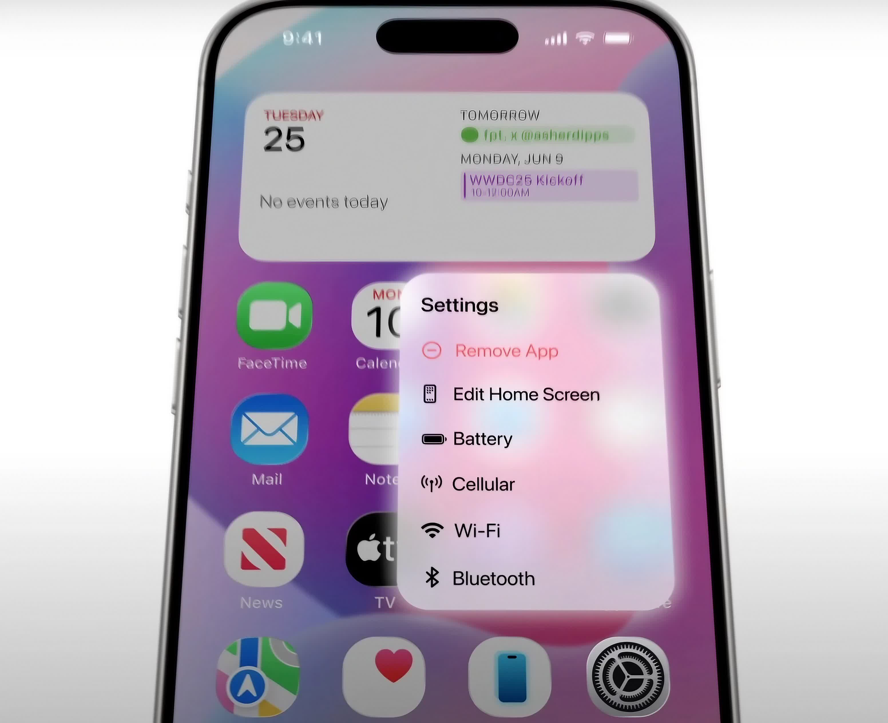
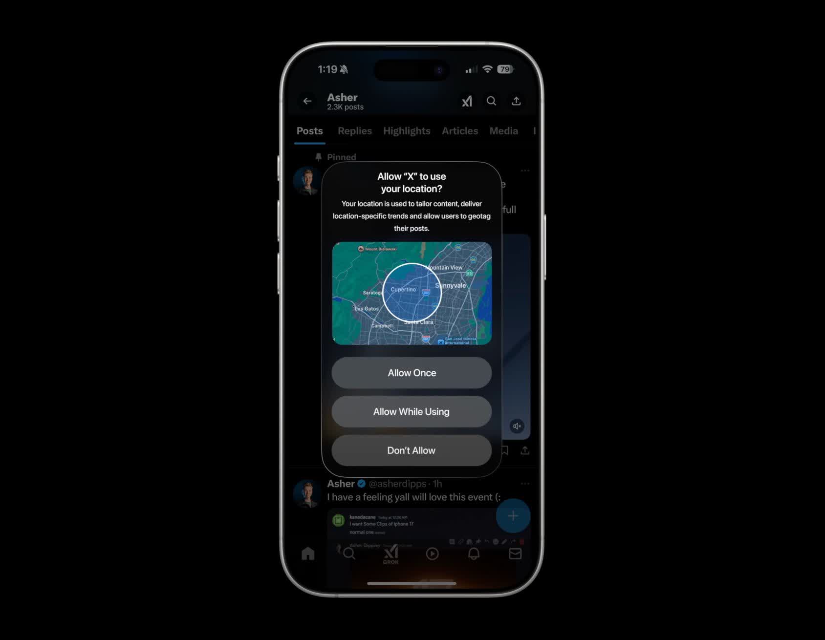
App icons, menus, and interface elements could be adopting a softer, more dimensional appearance. Icons could get rounder (though not as extreme as when we get on visionOS or watchOS), much like other UI components like permission dialogs and sliders. The app icons also look slightly “raised.”
The rumored update to Apple operating systems would revamp the UI across iPhone, iPad, and Mac devices.
Jon Prosser has released a 10-minute video detailing iOS 19’s possible new design language. The renders suggest the update may be moving away from the ultra-flat look that has dominated iPhones since iOS 7 – at least in some areas.
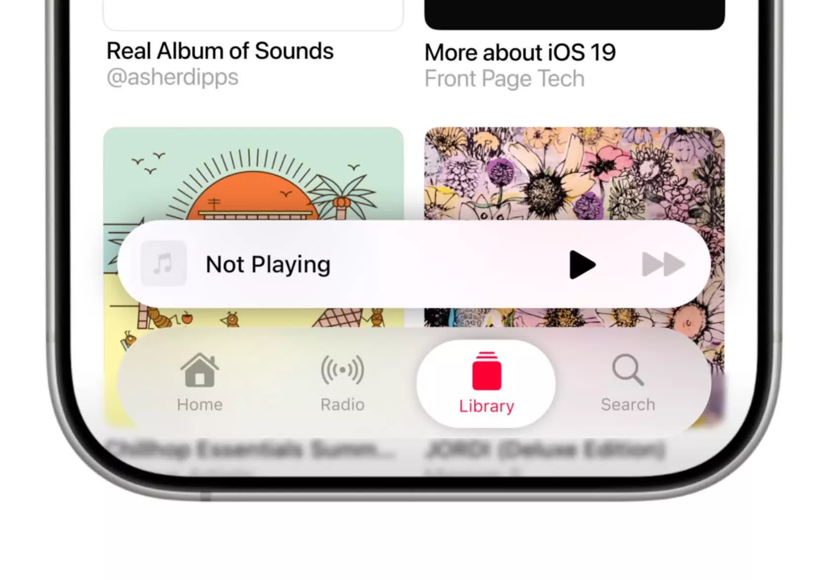
Another major change is a new “floating” navigation bar across native apps. Gone is the rigid, squarish dock glued to the bottom of the screen. In its place is an oval-shaped tab bar that hovers just above the display, featuring smoother animations as users switch between tabs. Internally, Apple is calling it “Tab View.”
Then there’s the Messages app, which is relocating its search bar from the top to the bottom center. Expect other native apps to follow suit. Even the lock screen is getting a refresh, with shinier animations for the camera and flashlight shortcuts.

Prosser notes that the Control Center has remained mostly unchanged. The brightness and volume sliders have become rounder, and the slightly raised design language has made its way to the controls as well – but that’s about it.
What’s interesting is how Apple is threading the needle between change and usability. The new design doesn’t completely upend what users know – icons are still recognizable, and core functions remain intact – but the tweaks add just enough freshness to make the OS feel modern.

Of course, leaks are never guaranteed. Apple could still tweak things before the final release. These renders are essentially Prosser’s team reverse-engineering what he saw in materials sourced from within the company – not actual screenshots – so take them with a grain of salt.
Source link